Chapter 13 Graphics
One of the most powerful tools we have in Statistics and Data Science is graphics. This includes images/pictures, graphs/plots, and tables. You will want to make sure that all graphical elements are appropriately sized in the Body. If there is text in a static image/picture, you’ll need to make sure that the text is legible on a variety of screen sizes.
We’ve already discussed both issues of color and text size in plots. For additional considerations, please refer to the following readings (ordered from most important to least):
- Tufte-Fundamental Principles of Analytical Design
- Tufte-Chartjunk
- Kosslyn-Looking with the Eye and Mind
Remember, we always want to be modeling excellent graphing behaviors.
All photographs can be fortified with words. –Dorothea Lange
A picture is worth a thousand words…but which ones? –Unknown
Both of these quotations highlight that you need to include some text with your plots to help the user construct their understanding of what you’re trying to show them.
13.1 Titles and Labels
Graph and Table titles should follow Title Case. Capitalize each word unless the word is “small” (e.g., of, an, etc.). The Title Case website can help you if you aren’t sure. (This website also does other types of case such as camel case.)
Axis and Legend Labels will follow Sentence Case. That is to say only the first word of each axis label and the legend will be capitalized. The remaining words will be lower case with two exceptions (proper nouns and unit abbreviations).
When dealing with quantities on axes, you need to include the unit of measurement in the label. Typically, the unit will be placed in parentheses at the end of the label and use appropriate abbreviations. For example, “Height (in)”, “Air pressure (mmHg)”, “Resting heart rate (bpm)”, etc. If the unit of measure is for a count, change the label to be along the followings lines: “Number of siblings”, “Number of bikes owned”, etc.
Labels should be informative without getting in the way of reading the graph.
13.2 Font Sizes
A common area for adjustment in R graphics is that font size. Many times, we might need to adjust the size of the text used in a plot so that the axis labels and titles are easier to read. There are a couple of different approaches you can use to effect this: change the base font size or change the font size for particular elements.
The easiest approach is to change the base font size and then let ggplot do the necessary alterations. To go this route, you will need to do the following:
# Letting examplePlot be an already created ggplot object
examplePlot +
  theme(
    text = element_text(size = 18)
  )
The above code should set the default font size for the entire plot to be 18 pt will potentially scale from there.
If instead you wish to be a bit more precise with the font size for different elements, you would need to something like the following:
# Letting examplePlot be an already created ggplot object
examplePlot +
  theme(
    axis.title = element_text(size = 18),
    axis.text.x = element_text(size = 14),
    legend.title = element_text(size = 18),
    legend.text = element_text(size = 14),
    plot.title = element_text(size = 24)
  )
In this example code, we’re instructing R to use size 18 font for the labels on both axes and the legend title. We’re also using size 14 font for the text that occurs in the legend as well as along the horizontal axis. (The vertical axis’s text will be the default size.) The plot’s title will be 24 point.
There are many different aspects of size that you can adjust with the theme function; these are just a few. To see the full list, look at the Help documentation for theme (?ggplot2::theme). For each of the elements, you will need to use element_text with a size argument to dictate what font size should be used.
You will need to play around with the font sizes to find one that will work well in a wide variety of situations. Keep in mind, that the font will not dynamically scale when you stretch/shrink the window or when you move between using a computer and mobile device.
13.3 Axes and Scales
The default axes for R’s base graphics are, well, absolutely terrible. The algorithms for axes in ggplot2 while better than base R are still in need of improvement. The default axes often do not fully cover the data as well as having gaps between the axes and the data. All this impedes the user’s construction of meaning. Thus, you’ll want to take control and stipulate the axes and scales to optimize what users get out of the plot. If you are providing multiple plots that the user is supposed to compare, make sure that they all use the same scaling and axes.
To force ggplot2 to place (0, 0) in the lower-left corner and to control the scales, you will need to include the following:
# Create the ggplot2 object
g1 <- ggplot2::ggplot(...)
# Add your layer
g1 + ggplot2::geom_point()
# Control axes and scale
## Multiplicative Scaling of the Horizontal (x) Axis
## Additive Scaling of the Vertical (y) Axis
g1 + ggplot2::scale_x_continuous(
  expand = expansion(mult = c(1,2), add = 0)
) +
  scale_y_continuous(
    expand = expansion(mult = 0, add = c(0,0.05))
  )
13.4 Legend Sizes
If you find yourself needing to enlarge the size of the legend key, you can use the following argument with any ggplot object:
# Change the size of legend elements in ggplot
g1 <- ggplot2::ggplot(...)

g1 +
  theme(
    legend.key.size = unit(2, "cm")
  )
The unit function takes two arguments: a numeric value that will be the measure and a unit of measure. In the above example, this will make legend examples 2 cm wide. You may need to experiment with this setting to find an optimal setting across a wide variety of screen sizes. That is, be sure to test your settings on both computers and mobile devices.
13.5 Color and Plots in R
In R you can set color theme which you use in ggplot2. Additionally, the package viridis provides several additional color palettes which are improvements upon the default color scheme.
We have developed two custom palettes for you to use with BOAST apps. These palettes are the boastPalette and the psuPalette and are part of the boastUtils package. We have worked hard to ensure that these palettes are consistent with color blindness and web standards as well as consistent with our color themes.
# To call a color from the boastPalette use
boastUtils::boastPalette[1]
## Numbers go 1 through 9

# To call a color from the psuPalette use
boastUtils::psuPalette[1]
## Numbers go 1 through 8

# Both palettes get used in the order of what is listed.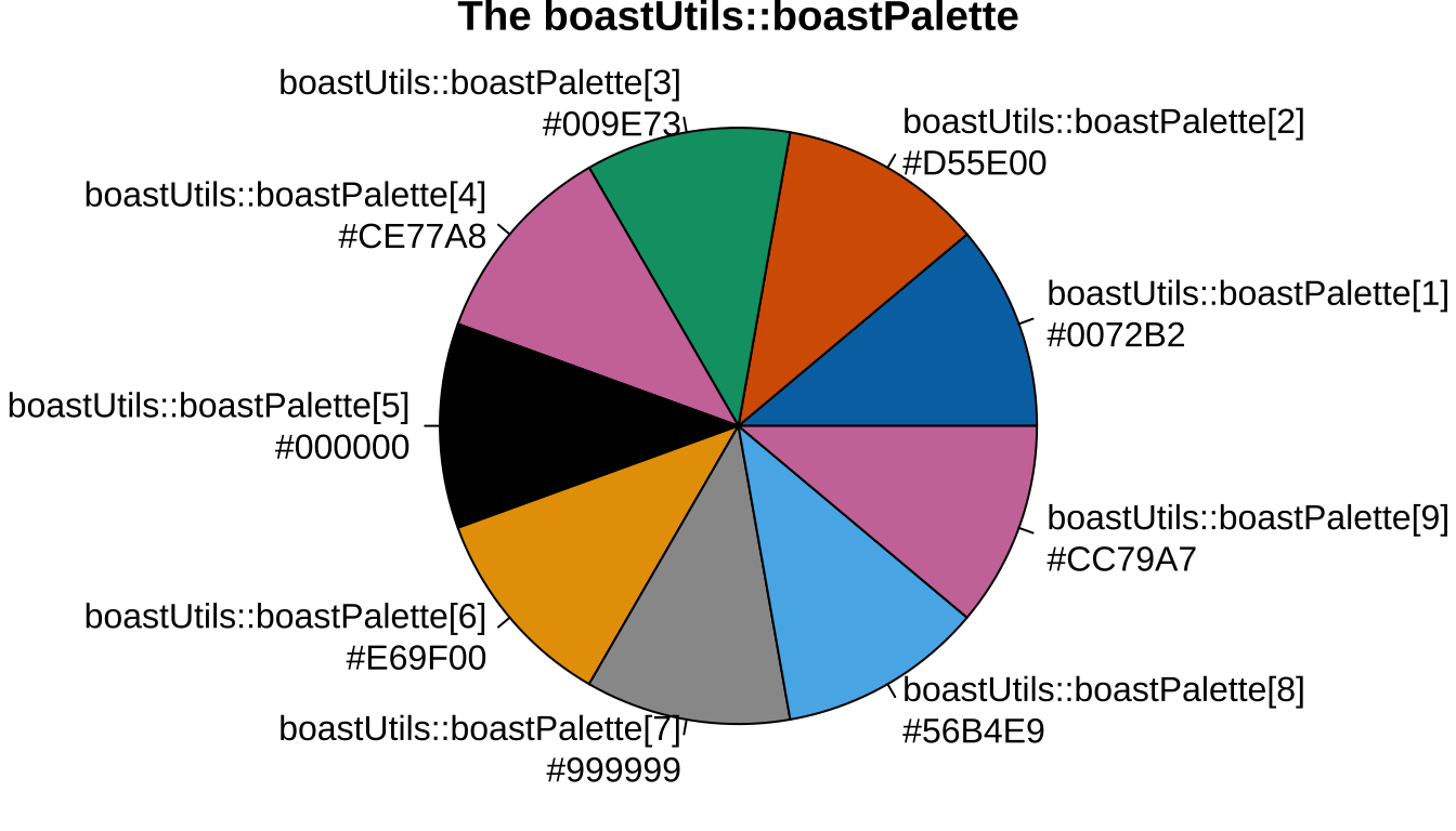
Figure 13.1: The Boast Palette
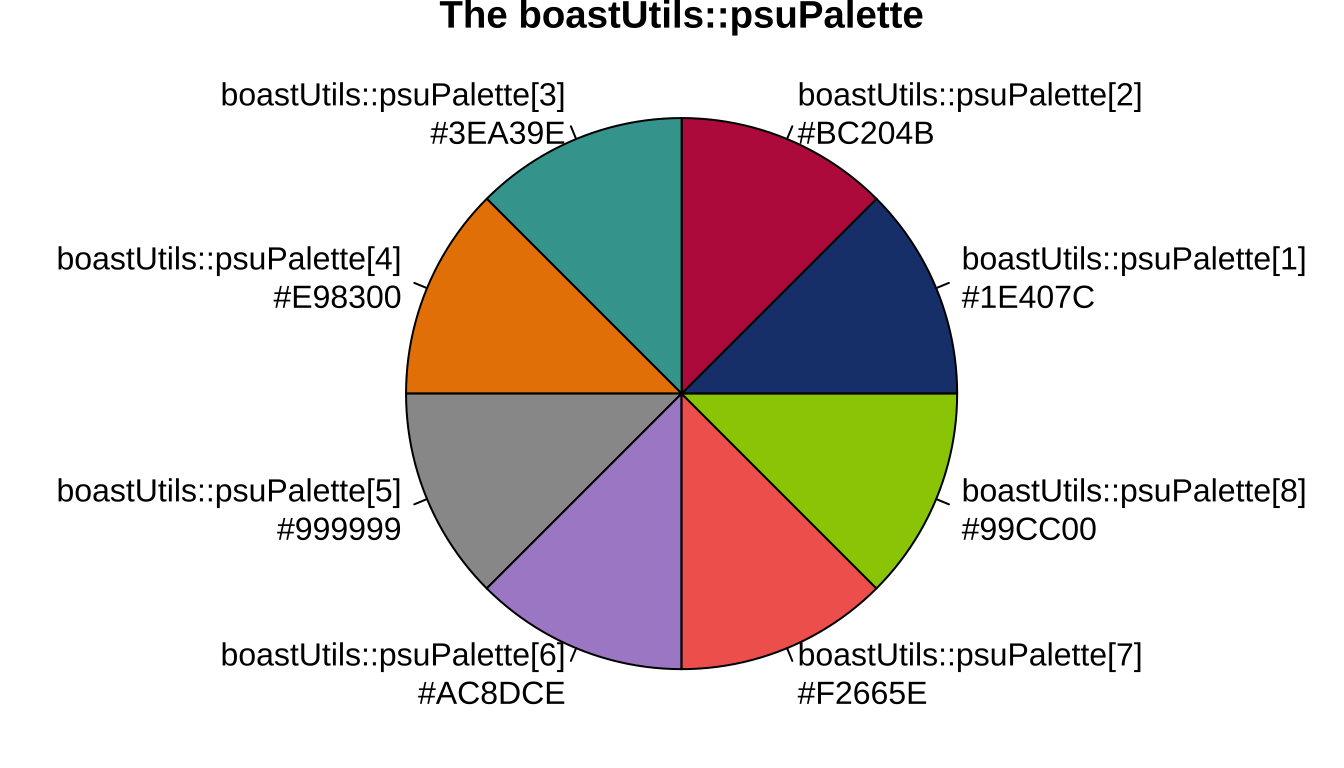
Figure 13.2: The PSU Palette
To use these palettes (or ones from viridis) with a ggplot2 object, you’ll need to do the following
# Create ggplot2 object
g1 <- ggplot(
  data = df,
  mapping = aes(x = x, y = y, color = grp, fill = grp)
) +
  geom_point() +
# Tell R to use your chosen palette
  scale_color_manual( # If you use "color" in aes
    values = boastUtils::boastPalette
  ) +
  scale_fill_manual( # If you use "fill" in aes
    values = boastUtils::boastPalette
  )

# You can also call colors individually
ggplot(
  data = data,
  mapping = aes(x = x, y = y)
) +
  geom_point(
    fill = boastUtils::psuPalette[2]
  )
If you have more groups than eight/nine colors listed in the two palettes, consider reworking your examples as you could overwhelm the user with too many colors. (This also applies to using different shapes to plot points.)
13.5.1 Color and Accessibility
Color can be a great tool to help highlight different cases. While we have striven to create palettes which are friendly for color blindness, we can go beyond color to help all users. One key way to do this is to partner color with the shape of a points and/or the style of line used. This can be done easily in ggplot by using both the color/fill aesthetic as well as the shape and/or linetype aesthetics. For example,
ggplot(
  data = exampleData,
  mapping = aes(
    x = height,
    y = weight,
    color = class, # color only stipulates the color for the border
    fill = class, # fill will color the entire point
    shape = class,
    linetype = class
  )
) +
  geom_point(size = 1) +
  geom_smooth(
    formula = y ~ x,
    method = "lm",
    se = FALSE
  ) +
  theme_bw() +
  theme(
    text = element_text(size = 18)
  )
The above code will produce a scatter plot. The color and shape of the points will depend upon the value of class for each observation. Additionally, the plot will contain linear trend lines for each level of class that repeats the color used for class on the points and uses different styles of lines (solid, dashed, dotted, etc.)
As with color, shape and line type can become taxing quickly. Thus, if you find yourself reaching multiple shapes/types (say 6 or more), we should reconsider the plot.
13.5.1.1 An Exception to Line Types
Currently, there is an exception to using different line types in conjunction with color. This is for the notion of creating multiple paths (e.g., see Law of Large Numbers app). Here, it is not as important that a viewer can distinguish between the individual curves. What does matter is whether the individual sees how the various curves converge or diverge. Thus, for path type plots, we will not worry about using line type in conjunction with color.
13.5.2 Common Color Usage
Throughout BOAST, we often have certain re-occurring elements in plots. These include elements such as estimates, null values, population parameters (“true value”), etc. To build consistency across the many apps, we use the following standardized colors for these elements:
- Confidence Intervals
- Containing the true value:
psuPalette[1] - NOT containing the true value:
psuPalette[2]
- Containing the true value:
- Population Parameter/true value:
psuPalette[3] - Observed Estimate:
psuPalette[4] - Null Value (Frequentist) or comparison value (Bayesian): “black”
- Likelihood: “blue”
13.6 Transparency
In different situations, we may want to set the transparency of a graph object to be something other than opaque. We can do this with the alpha aesthetic. The values for alpha go from 0 (transparent) to 1 (opaque). You may need to play with several different values to find the optimal setting for your plot.
13.7 Histograms
When dealing with histograms, especially when using ggplot, we need to think about what to use as the width of the bins (or alternatively, the number of bins). The ggplot2 approach has a default of 30 bins but is also complains when you use this setting:
stat_bin()usingbins = 30. Pick better value withbinwidth.
To avoid this message from getting placed into your log as well as getting displayed to your users, you can either find an optimal number of bins (or bin width) OR you can invoke the Freedman-Diaconis Rule to set the value of binwidth:
13.8 Tables
Data tables can pose a challenge for individuals to comprehend. Just as a wall of text isn’t conducive to helping a person understand what’s going on, neither is a wall of data values. Thus, we need to be extreme judicious (picky) about incorporating data tables into any of our apps.
In web development there are two main types of tables: layout tables and data tables.
- Layout tables help control where different elements appear on the page.
- We need an additional distinction for data tables:
- Summary Data Tables are tables that have summary information; typified by two-way tables (a.k.a. contingency tables or crosstabs) but might also include other things such as values of descriptive statistics stratified by groups.
- Data Sets are an entire data object, presented in tabular format
Layout Tables should never be used in a BOAST App.
Data Sets should be displayed as sparingly as possible. In order to include a Data Set display, you will need to have identified an explicit learning goal/objective that necessitates the user digging through a data frame. If you can’t identify such a learning goal, you should NOT include a data frame.
If the goal is to allow the user to look through the data set OR to have access to the data, then give a link to either the original source of the data (preferred) or for them to download the file.
Summary Data Tables can be used more often and can enrich the user’s experience with your app. However, these must still be constructed in an appropriate manner.
Neither Data Sets nor Summary Data Tables should be inserted into your App as a picture. This is an big Accessibility violation. Use the directions below to create the appropriate type of data table.
13.8.1 Displaying Data Tables
Your first step is to create a data frame object in your R code.
- If you are displaying a data set (rare), then you will either need to read in the data or call that data frame. For this example, we’ll be using the
mtcarsdata frame that is part ofR. - If you are making a Summary Data Table, you’ll need to either use
Rto calculate the values and store in a data frame or create a data frame yourself.
In either case, be sure you identify what columns you’re going to use. If your original data file has 50 columns, but your App only makes use of 5, drop the other 45. Only display the columns that you actually use.
Your next step is to decide on where to put this display (e.g., inside an Exploration Tab or as a separate page). This will help you identify where in your App’s UI section you need to put the appropriate code.
To ensure that your data table is accessible and responsive (i.e., mobile friendly), you will need to use the DT package.
In your UI section, you’ll need to use the following code, placed in the appropriate area:
Then, in your Server section, you’ll need to use the following code:
# [code omitted]
# Prepare your data set with only the columns needed
carData <- mtcars[,c("mpg", "cyl", "hp", "gear", "wt")]

## Use Short but Meaningful Column Names
names(carData) <- c("MPG", "# of Cylinders", "Horsepower", "# of Gears", "Weight")

# Create the output data table
# Be sure to use the same name as you did in the UI
output$mtCars <- DT::renderDT(
  expr = carData,
  caption = "Motor Trend US Data, 1973-1974 Models", # Add a caption to your table
  style = "bootstrap4", # You must use this style
  rownames = TRUE,
  options = list( # You must use these options
    responsive = TRUE, # allows the data table to be mobile friendly
    scrollX = TRUE, # allows the user to scroll through a wide table
    columnDefs = list(  # These will set alignment of data values
      # Notice the use of ncol on your data frame; leave the 1 as is.
      list(className = 'dt-center', targets = 1:ncol(carData))
    )
  )
)
# [code omitted]
If you are making a Summary Data Table, you will need to follow the same process. If your data frame does not have row names, but instead a column with values acting as row names, you may replace the rownames = TRUE with rownames = FALSE; there should not be a column of sequential numbers on the left.
Column names MUST be simple and meaningful to the user. To this end, you should rename any columns that might have poor choices for names, just as we have done with the mtcars data. This includes using Greek characters in isolation. You should not have any columns labeled \(\mu\) or \(\sigma\). Rather you need to use English words.
Note: getting mathematical expressions to render properly in graphical environments in R is not as easy as in the paragraphs or headers of an app. Only certain graphing packages support limited mathematical expressions. The same is true for table generation packages.
Again, try to use tables as infrequently as possible. Poorly constructed tables can create accessibility issues causing screen readers to poorly communicate tables to your users. If you run into problems and/or have questions, talk to Neil and Bob.
13.8.2 Additional Table Examples
Neil built a Data Table Examples app that you should reference when you’re building data tables for display. (Note: you will need to connect to PSU’s VPN in order to access this app.)
We’re including some additional Summary Data Table examples. For these examples, I’m going to make use of the palmerpenguins package of data sets.
13.8.2.1 Summary Data Table of Descriptive Statistics
library(palmerpenguins)
library(psych)
library(DT)
library(tibble)

penStats <- psych::describeBy(
  x = penguins$body_mass_g,
  group = penguins$species,
  mat = TRUE, # Formats output appropriate for DT
  digits = 3 # sets the number of digits retained
)

# Picking which columns to keep
penStats <- penStats[, c("group1", "n", "mean", "sd", "median", "mad", "min", "max", "skew",
                         "kurtosis")]
# Make the group1 column the row names
penStats <- tibble::remove_rownames(penStats)
penStats <- tibble::column_to_rownames(penStats,
                          var = "group1")
# Improve column names
names(penStats) <- c("Count", "SAM (g/penguin)", "SASD (g)", "Median (g)", "MAD (g)", "Min (g)",
                     "Max (g)", "Sample Skewness (g^3)", "Sample Excess Kurtosis (g^4)")
# Make the Table
output$penguinSummary <- DT::renderDT(
expr = penStats,
caption = "Descriptive Stats for Palmer Penguins",
style = "bootstrap4",
rownames = TRUE,
autoHideNavigation = TRUE,
options = list(
responsive = TRUE,
scrollX = TRUE,
paging = FALSE, # Set to False for small tables
columnDefs = list(
list(className = 'dt-center',
targets = 1:ncol(penStats))
)
)
)13.8.2.2 Summary Data Table for Output Table
While this example is for an ANOVA table, you can build from this for other output tables. If you store the output of any call as an object, you can then use the structure function, str to investigate the output. Ultimately, you need something that is either a matrix or a data frame.
library(palmerpenguins)
library(psych)
library(DT)
library(tibble)
library(rstatix)

# This bad practice but I'm going to pretend that all assumptions are met
penModel <- aov(body_mass_g ~ species*sex, data = penguins)

anovaPen <- round(anova(penModel), 3)
# Rounding to truncate decimals
# Make the Table
output$penguinAnova <- DT::renderDT(
expr = anovaPen,
caption = "(Classical) ANOVA Table for Palmer Pengins",
style = "bootstrap4",
rownames = TRUE,
options = list(
responsive = TRUE,
scrollX = TRUE,
paging = FALSE, # Set to False for small tables
columnDefs = list(
list(className = 'dt-center',
targets = 1:ncol(anovaPen))
)
)
)13.9 Alt Text, Again
Any graphical element you include in your App MUST have an alternative (assistive) text description (“alt text”). This provides a short description of what is in the image or plot for users who are visual impaired. (Tables, when properly formatted will handle this automatically.)
Here are several resources worth checking out:
13.9.1 Adding Alt Text Graphs–alt Argument
With the release of Shiny version 1.6.0, the renderPlot function got a vital upgrade: there is now an alt argument that will allow you put alt text on your plots. The alt argument functions just like the matching argument in the tags$img call for static images.
Use this approach as your first choice method. The alt argument of renderPlot can be dynamically updated using user inputs, if you use renderPlot inside a reactive environment such as observeEvent.
Generally speaking, keep your alt text to no more than 140 characters in length. Be critical with your word choice and don’t use waste words. For example, rather than setting alt text to “a picture of Neil Hatfield wearing a shirt and time”, use “headshot of Neil Hatfield”. Example of waste words include phrases such as “a plot of”, “a histogram of”, “a pie chart of”, etc. Focus your alt text on describing the vital aspects of the plot.
13.9.2 Alt Text via ARIA
If a graph is particularly complicated and/or you need more than 140 characters, you might want to consider using Accessible Rich Internet Applications (ARIA) to assist us in writing some labels that will stand in place of formal alt text. To do this, you will need to make use of the following code:
# [code omitted]
# In the UI section, in the appropriate tabItem
plotOutput(outputId = plotID) # Look for lines like this
# Code for adding the aria label
tags$script(HTML(
  "$(document).ready(function() {
  document.getElementById('plotId').setAttribute('aria-label',
  `General description of the plot`)
  })"
))
# [code omitted]
Important things to note:
- Place the
tags$script(HTML(...))code right after each instance ofplotOutput. - Copy the above code as formatted
- Change the two (2) pieces for each particular plot
- Replace
plotId(keep the single quotation marks in the code) - Replace
General description of the plot(keep the single quotation marks in the code)
- Replace
ARIA labels can be used in conjunction with alt text. Additionally, if you have a complex plot, you might want to type up a description of the plot that you’ll place in your app for all users to see. We can use ARIA commands to direct screen readers to connect the plots to any paragraph elements as well. Keep in mind that thinking about accessibility improves your app for all users.