Chapter 10 Common Elements
This second part of the App Layout deals with the coding and set up of elements that are common across many of the apps in BOAST. We strive to use consistent coding for these elements as this will improve the user experience.
We anticipate that this chapter will be one of the chapters you most heavily reference as you work on developing your apps. Over time, you’ll become more proficient at coding and will not need to rely on this chapter as much.
10.1 Fluid Rows and Columns
HTML is a linear language, by this we mean that as browsers interpret each line of HTML, the rendered elements appear one after the other vertically, from top to bottom. Since Shiny takes your R code and translate all of it to HTML, our apps also get rendered in this linear format. Thus, the way you order your code should reflect a top-down construction of your page.
This linear flow works well in many cases…until you want to put two (or more) elements side-by-side. To make elements appear next to one another horizontally, we need to make use of two important functions: fluidRow and column.
The fluidRow function tells R/Shiny that you want to put multiple elements into the same row of the page. The “fluid” aspect refers to the fact that this function will automatically adjust the row by wrapping the content to fit the size of the screen. This is important to ensure that your app can respond to being on a mobile device like a phone or a tablet. (Regular elements such as the dashboard environment, paragraphs, etc. will automatically adjust.)
Using fluidRow is fairly straightforward. Simply call the function and list all of the elements that you want in the same row as separate (unnamed) arguments. The elements will get listed in the order you code them, left to right, in the displayed row. For example, fluidRow(objectA, objectB, objectC).
Our practice is to be a bit more precise with how we want to divide up the space in a fluidRow call. This is where the column function comes into play. Each fluidRow is internally divided into twelve (12) columns. The column function allows us to say how many of those columns to give to a particular element (the width argument) as well as how many empty columns we want to put between the left edge or the previous filled column (the offset argument).
For example, say that we want to make a row that has two buttons: one at the left edge and one at the right edge. We can use fluidRow and column calls to achieve this:
# In the page layout portion of UI code
fluidRow(
  column(
    width = 2,
    offset = 0,
    bsButton(
      inputId = "button1",
      label = "Left button",
      # code omitted
    )
  ),
  column(
    width = 2,
    offset = 8,
    bsButton(
      inputId = "button2",
      label = "Right button",
      # code omitted
    )
  )
)
By using offset = 8 in the second column call, we placed 8 empty columns between the first button and the second button. Further, each button gets to take up two columns of space (i.e., 2/12ths of the row) to appear (width = 2).
The most common coding problems to arise with fluidRow and column are:
- Forgetting to place
columninside of thefluidRow. This won’t be a fatal crash of your app, but your app won’t look right. - Not setting
widthto an integer between 1 and 12. You must provide a value forwidthin eachcolumncall. - Not checking that all
widthandoffsettotals add to 12 within a singlefluidRow. Look through yourfluidRowand add up all of thewidthandoffsetvalues. You want that sum to be 12 so that you know that everything will be appropriately arranged. If you go over 12, you might get an error and/or your app might scale/wrap elements in strange ways. Similarly for if you are under 12.
Note: the dashboard environment automatically allows for fluidRow to be used. Thus, you do not need to include any fluidPage calls in your app.
10.1.1 Nesting fluidRow
While it is technically possible to nest fluidRow calls, we do not recommend doing so. This could look something like fluidRow(column(width = 3, fluidRow(...)),...). This can create serious navigational problems for any users who rely on using their keyboard rather than a mouse to move through and interact with your App. If you find yourself wanting to nest fluidRow, stop yourself and reach out to Neil and Bob for alternative ideas.
10.2 Well Panels
Well panels are visual styling that we use to help offset user controls (i.e., inputs) from both context and graphs (i.e., outputs).
To place something inside of a well panel, all you need to do is wrap that object in the wellPanel function. However, the placement of the wellPanel call matters.
If you wrap each individual element in wellPanel you’ll get a separate well panel for each call. If you place wellPanel too high up in your code, you’ll end up putting everything into the well panel.
# In the UI Section
# [code omitted]
# Inside a tabItem
fluidRow(
  column(
    width = 4,
    offset = 0,
    wellPanel( # Placing the wellPanel call here will wrap around all controls
      h3("Controls"),
      sliderInput(
        inputId = "mtcAlpha",
        label = "Set your threshold level, \\(\\alpha_{UT}\\):",
        min = 0.01,
        max = 0.25,
        value = 0.1,
        step = 0.01,
        animate = animationOptions(interval = 1000, loop = TRUE)
        ),
      br(), # creating vertical space between sliders
      sliderInput(
        inputId = "mtcTests",
        label = "Set the number of hypothesis tests conducted:",
        min = 0,
        max = 500,
        value = 5,
        step = 5
        )
      ) # this closes the wellPanel
    ), # this closes the first column
  column(
    width = 8,
    offset = 0,
    h3("Plot"),
    plotOutput("pplotMTC"),
    bsPopover(
      id = "pplotMTC",
      title = "Investigate!",
      content = "What happens to the number of statistically significant tests when you
      increase the number of tests?",
      placement = "top"
      )
    ) # closes second column
  ), #closes the fluid row
The above code highlights using the wellPanel to place all of the controls into a well panel as well as placing that well panel into the first column of a fluid row.
10.3 Collapsible Boxes
One technique that we can make use of to cut down on the amount of visible text on a page is through the use of collapsible boxes. Collapsible boxes are preferred than other methods in that 1) the content remains on the page and thereby accessible, and 2) the user retains control for when to show/hide this information.
Two great places to consider using collapsible boxes include the Prerequisites Tab and static Context Information across the top of an Activity Tab.
Note: if the context information changes (e.g., can be switched due to user actions), then collapsible boxes should NOT be used. The context in these cases should always remain visible.
10.3.1 Creating Collapsible Boxes
To create a Collapsible Box, you’ll need to work in th UI section of your code:
# [code omitted]
box(
  title = strong("Title for the Box"), # Use the strong tag
  # Give either the title of the review concept or "Context"
  status = "primary", # Leave as primary
  collapsible = TRUE, # This allows collapsing
  collapsed = FALSE, # Initial value
  # If the only collapsible item, use FALSE
  # If there are multiple, the first one is FALSE, others can be set to TRUE.
  width = '100%', # use this setting
  "The text that will 'disappear' goes here."
),
# [code omitted]
Given the static nature of the information in a collapsible box, you should not need to add anything to the server definition.
The styling of Collapsible Boxes is controlled by the central CSS file. If you use the above code as your template, the coloring will automatically match your App’s assigned color theme.
10.5 Inputs
In addition to buttons, users will often interact with your App through the use of inputs. There are a variety of different kinds of inputs that you can make use of; some will be part of the base Shiny packages, others will come from some additional packages.
Generally speaking, use the simpliest style of input as you can as that will be easier for your users.
No matter what type of input you’re using, there are two absolutely required arguments you must include with non-empty, non-null values: inputId and label. As we’ve explained, these two arguments are vital to create the input field, reference their values, and make the input accessible.
10.5.1 Types of Inputs
Here is a listing of the most common inputs in BOAST.
Basic Inputs, part of the shiny package:
checkboxInput: create a single checkboxcheckboxGroupInput: create a set of related checkboxes (users may select one or more)radioButtons: create a set of radio buttons where users may only select ONE of the options at a timesliderInput: create a numeric slider bar (can have one or two knobs)numericInput: create a field where users can enter a numbertextInput: create a field where users enter textselectInput: create a dropdown menu where users select one (or more) options
Inputs from the shinyWidgets package:
switchInput: create a toggle/switch between two optionscheckboxGroupButtons: create a set of buttons that act like a set of checkboxes.sliderTextInput: creates a slider with text labels (use sparingly and use this instead ofsliderInputwith extra CSS)
Input from the shinyMatrix package:
matrixInput: creates a matrix of either character or numeric inputs
Each of these inputs have different arguments that you will need to attend to as you code your App.
10.5.2 Animation of Sliders
One feature of slider inputs is the option to include a Play/Pause button that allows the user to create an animation of your plot. Enabling this option can be quite useful if allowing the user to move through the whole set of slider values is desirable.
To enable this, you’ll need to make use of the animate argument:
#[code omitted]
sliderInput(
  inputId = "mtcAlpha",
  label = "Set your threshold level, \\(\\alpha_{UT}\\):",
  min = 0.01,
  max = 0.25,
  value = 0.1,
  step = 0.01,
  animate = animationOptions(
    interval = 1000, loop = TRUE))
#[code omitted]
You can set animate=TRUE, animate=FALSE or invoke the animationOptions function as we’ve done in the example and recommend. This will force you to make some important decisions: namely, how long the slider should wait between each movement (interval, in milliseconds) and should the animation start over once the slider reaches the maximum (loop).
The interval is going to the most challenging value to figure out. This timer ignores everything else; that is, it doesn’t wait to see whether your plot has updated. Remember, the more complicated the process that generates your plot is, the longer your App will need to render the plot. Thus, you can quickly get into a case where the slider has advanced several times while your App is still trying to render the first update. While renderCachePlot can help speed things up, keep in mind that you still might need to play around with the interval value to ensure smooth functionality.
Make sure when you’re testing an animated slider to vary all of the parameters involved in the graph. This will help ensure that you test adequately.
The styling of the play/pause button will be controlled by the BOAST CSS file.
10.5.3 Ordering Inputs
One of the most powerful aspects of Shiny apps is that the user interacts with them. Thus, we need to consider not only the ways in which user interact (e.g., buttons, sliders, text entry, etc.) but also the order in which you want the user to manipulate the inputs. Coming up with a single declaration for how to order inputs in all cases is not necessarily feasible. However, we can set up general guidelines for how to make decisions on ordering your inputs.
Please use the following guidelines for determining the order of inputs in the User Interface (UI):
- In general, if you want your user to do things in certain order, make your inputs appear in that order. For example, If you want them to pick a data set, then an unusualness threshold/significance level, what attribute to test, and then set a parameter value, then your inputs should appear in that order.
- Make use of how we read the English language (i.e., Top-to-Bottom and Left-to-Right) to provide an implicit ordering for your user.
- If a user needs to carry out steps in particular sequence for your App to run properly, then place your inputs inside of an Ordered List environment with explicit text on what they should do. For example,
- Choose your data set: [dropdown]
- Set your unusualness threshold/significance level
[slider]
- Which attribute do you want to test: [dropdown]
- What parameter value do you want to use: [numeric input]
- Choose your data set: [dropdown]
- If an input is going to reset other inputs you should either:
- Warn the user before hand
- Move the input to the top of the list
- Program the input to not reset other inputs, or
- Some combination of the above
- Warn the user before hand
- If the inputs are not dynamically linked to the output (e.g., plots automatically update with a change in the input’s value), then you should include a button that says “Make Plot” at the end of the inputs.
10.6 Correct/Incorrect Marks
In games, you can give the user a visual cue as to whether they are correct or incorrect through the use of three images:


Figure 10.1: Correct, Partially Correct, and Incorrect Marks
To display these marks you’ll use the renderIcon funtion from the boastUtils package. There are two key arguments to the renderIcon fuction:
icon: you’ll need to use either"correct","partial", or"incorrect"width: this will be the number of pixels you want the icon to be. The default is 36, which is good in most cases.
To turn off/hide these marks you can use renderIcon() without any arguments.
It is important that you only access these marks through renderIcon as we’ve pre-programmed consistent and appropriate alt text for these marks.
Their placement in your App will depend upon what makes the most sense.
10.7 Alerts and Messages
A universal rule to keep in mind when building Apps is that users will do things that you did not intend for them to do. This can cause your App to crash. While we can’t anticipate every possible way a user might inadvertently break your App, we can program ways to handle some of those actions. This is where sending alerts comes into play.
The most common type of message revolves around the inclusion of an Information button (the button in the Dashboard Header). This Information button provides a quick reminder of general instructions for the app.
For both alerts and messages, we will turn to the sendSweetAlert function from the shinyWidgets package.
# In your server definition
observeEvent(
  eventExpr = input$exampleTrigger,
  handlerExpr = {
    sendSweetAlert(
      session = session,
      type = "info",
      title = "Title of Message",
      text = "message to user"
    )
  }
)
Notice that we need to place the sendSweetAlert function inside of an observeEvent. The four arguments we’ve listed are the four basic aspects you must program any time you want to send an alert or a message to your users.
The session = session argument does not need to change and ensures that the correct user gets the message.
10.7.1 Alert Types
The type argument acts much like the style argument for bsButtons. You may use any one of the following types:
info: This is the default type and is used for passing a message to the user.success: This is when your message is related to the user reaching some achievement. For example, they have logged in, they have won a game, etc. This is NOT appropriate for getting individual questions correct.warning: This is for when the user might have done something that could create a problem later on. Their action isn’t necessarily a problem now, but could become one in the future.error: This is for when the user has done something that will result in an error or App crash unless they take some other action.
As you build error checking into your app, using error and warning for alert types will be important.
10.7.2 Alert Title and Text
All alerts and messages should include a short title that be rendered with the actual message. (Any formatting of the title will automatically be taken care of.)
These titles should not be overly long or complicated. For info and success types of alerts using "Information" and "Success!" are often sufficient.
While you could do something similar for both warning and error types, you might want to consider including a bit more information. For example, rather than using title = "Error!", you might want to use title = "Error: Invalid Sample Size" instead. Notice that the title helps direct the user to what they need to fix.
You can’t put everything into the alert’s title argument. This is where the text argument comes into play. Give more details AND ways in which the user can fix the error with the text value.
Your message can be rather simple text (the previous example), or you can use HTML tags to make the message more structured:
observeEvent(
  eventExpr = input$info,
  handlerExpr = {
    sendSweetAlert(
      session = session,
      type = "info",
      title = "Information",
      text = tags$div(
        "Use the app in two ways:",
        tags$ol(
          tags$li(
            "Click on the ", tags$strong("Explore"), " page to explore how to
              read Hasse Diagrams and how to use them to figure out the proper
              denominator to use to test a give node/term."
          ),
          tags$li(
            "Click on the ", tags$strong("Diagram Wizard"), " page to use the
              app to build your own Hasse diagram. The wizard will walk you through
              the necessary steps and then produce a diagram you can save as well
              as the R code to re-create the diagram."
          )
        )
      ),
      html = TRUE # you must include this new argument
    )
  }
)
Notice that we had to include the html = TRUE argument to sendSweetAlert. You will need to do this any time you include HTML tags in the text argument.
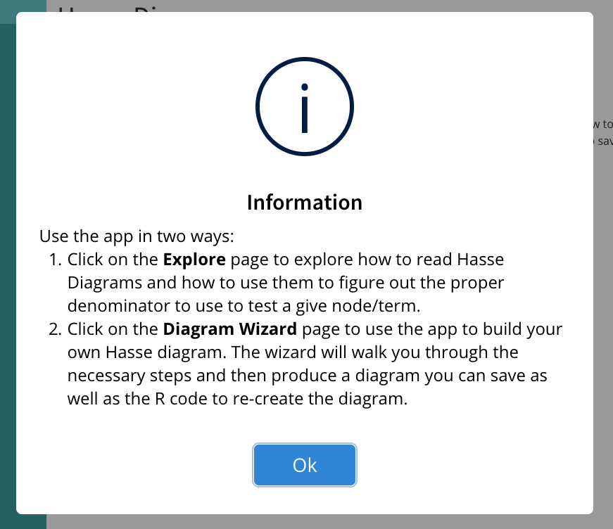
Figure 10.2: Example of HTML Tagged Message
10.8 Popovers and Tooltips
Have you ever been on a website and as you move your mouse over different elements on the page, a bubble of text appears? What you’ve experienced is an example of a Popover or Tooltip. While these can be useful tools, more often than not, they are abused as they lend themselves to the “shiny” problem.
For information about popovers, rollovers, hover text, or tool tips, please see Section 14.2.
10.9 Progress Bars
Consider adding a loading bar to show the process for intense computations; this will help the user understand that your App is processing and not frozen/broken.
We will there are a couple of different methods out there for adding a progress bar.
- Use the
shinyWidgetswith theirprogressBar,progressSweetAlert, andupdateProgressBarfunctions. - Use the
shinycssloaderspackage’swithSpinnerfunction. At this point in time we do not have a strong preference on which method to use. Make sure you discuss your needs with others and get plenty of feedback.